I backed the Jelly Max on Kickstarter as soon as it was announced. It's larger than the old Jelly phones, which I liked but ultimately stopped using.
I wrote about the Jelly 2 that it fits in every pocket I have, even in my tightest jeans, it runs the apps I need, and if it makes me spend less time on Twitter, that's fine.
Fine, all true, all correct. Why did I eventually switch back to my old Xperia XZ1 Compact?
Part of the story is that the nice guys who build LineageOS for the xz1c kept providing upgrades (here's Android 14), another part is that the bezels on the Jelly 2 ought to be narrower, a third part is that I couldn't find a good phone holder for my bike. I had to switch from the Jelly 2 to the xz1c before a weeklong bicycle trip and… never switched back. I liked the Jelly 2, just not well enough to move Signal and a few other apps back.
Here's a photo of the xz1c (in front) and the new Jelly Max (behind):
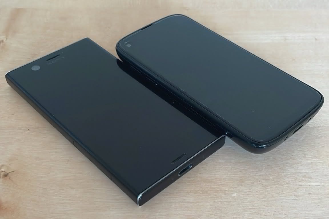
They lie flat on the same table. As you can see, the Jelly Max is similar to my current xz1c, but thicker and heavier. It's nicely shaped and lies well in the hand, it has good battery lifetime, much more storage, a nice minimal version of Android, and as usual Unihertz has done an excellent job of many small things. 180g though, against 140g for the xz1c, and the xz1c slides into a pocket in a way that the Jelly Max doesn't.
Which phone will I end up carrying?
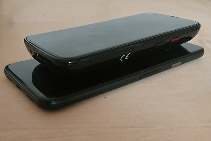
Update: Three months have passed and after a bit of back and forth I carry a Pixel 5 (comparison photo), which is a bit too large for me but I like it apart from that. Slim rounded form, narrow bezels, fits well on my bike, has the 5G support that I really need on some of my trips.
User interfaces change with the times. A 3½" diskette as an icon in apps may now be obscure because hardly anyone has seen the physical object in 25 years, and applications based on swiping have functional differences from older mouse- or keyboard-based ones. That isn't what I have in mind today. Apps that swipe may be fashionable, but the swiping is at least partly a matter of function. This post is about pure visual fashion — choosing particular kinds of shapes, sizes, fonts, colours, textures and animations instead of other kinds.
I'll discuss a modern, stylish photo from a web site that's 100% about popular fashion, and then a screenshot of a modern, stylish android app. By popular fashion I mean fashion that comes from the vox populi rather than from designers in Paris or the Vogue editors. Instagram's click-fuelled feedback loop produces that, I think, and the photo below is arch-instagram. The app is a high-quality app from a small company. They couldn't be more different, and what I'll describe is their similarity. […More…]
The Unihertz Jelly was small and fine, and I did like it but I had to give it up. The battery wasn't good enough for my use when travelling, and now that my eyes are fifty years old I admit I found the screen too small.
At the time I wrote that a smartphone should be small and light, have a large screen and battery, be fast enough, and not have too many bugs. Obviously there's a conflict between overall size and screen/battery size.
Now that Unihertz has shipped a slightly larger Jelly 2 I decided to buy one to try (after worrying for a while about whether the screen was a large enough part of the phone's front). I've used it for a while now.
The phone isn't elegant, chic, stylish or pretty. I want it to stay in my pocket, out of sight, so logically speaking I shouldn't mind its looks. I really shouldn't. On the other hand, it's well-built and feels solid. It lies well in the hand.
There's a visible Torx screw (that does nothing?).
The apps I want to run work, even though they clearly are designed for bigger screens. The battery and screen are OK. A very small screen is a very small strain on the battery, but the screen is big enough for my eyes and I can enter text.
Like its predecessor, the Jelly 2 is not fun. That's a good thing in my opinion. This phone can be used to call, it can speak in my ear and tell me to turn right at the next intersection, it can be used for 2FA and my other apps, and it isn't a timewaste magnet. Browsing Instagram, Twitter and so on is possible, but that kind of thing isn't attractive on this phone's display. This is perhaps one reason that I don't worry about the battery. I charge it I notice it's low and don't worry. If I charge it in the morning, I always have >50% battery left in the evening.
It fits in every pocket I have, even in my tightest jeans, it runs the apps I need, and if it makes me spend less time on Twitter, that's fine.
Many more months have passed, the Jelly Pro is still in my life, and it now runs Android 8.1.
Android 8.1 runs well, but one configuration setting absolutely must be changed: settings → smart assistant → power save manager
and then turn that off. The power saving regime provided by Android 8 is better, and the third-party power save manager
Unihertz has included confuses […More…]
Another few weeks have passed.
I have made up my mind to ditch the Jelly and go back to a bigger phone, in fact I've made up my mind to that several times. And I've also made up my mind that I cannot possibly do that.
It's difficult. One one hand many things work so well on the Jelly. I have apps, for example Google Authenticator, on a device that is unobtrusively small and is not a timewaste magnet. On the other, data entry can be a pain. Last Satuday I wanted to know whether I had time to get to a shop before it closed, and I remembered the shop's location but not its name. I found it, which makes the Jelly qualitatively different from other small phones, but the data entry was impractical compared to a large smartphone.
I don't buy a lot of hardware any more, and nothing out of the ordinary... but I have a credit-card-sized smartphone called Jelly (a Jelly Pro actually, with 2GB RAM).
A smartphone should be small and light, have a large screen and battery, be fast enough, and not have too many bugs. Obviously there's a conflict between overall size and screen/battery size. The Jelly is a very different compromise than most smartphones — most phones fit barely in a pocket, or only in some pockets, and provide large screens on which apps work well. The Jelly starts by fitting easily in any pocket, and makes the apps work as well as possible on a very small screen.
It succeeds on size: I can stick the Jelly in tight jeans pockets and sit down without noticing that it's there. […More…]
Our latest little film-playing box is a Nexus Player. It's good.
We have it connected to an Epson 1920×1080 projector and a Musical Fidelity amplifier.
The most remarkable features of the Nexus Player are that its remote control is simple and does not require line of sight, and that as of Android 6.0.1 it supports USB audio. […More…]
I've hated the Cyanogenmod 11 boot animation since I first installed Cyanogenmod on my phone. Admittedly I don't see it often, but I hate it. These walking fingers, possibly drawn by Will Holmes, would be so much better. So I put together a shell script to convert animated GIF files to the format Android needs.
Now and then phones are lost, particularly at schools, and I have two children, so I added an option to add text.
Reddit's mesmerizinggifs is full of suitable input files. To download today's highest-scoring animation and annotate it with Nirmala's phone
: […More…]
I've implemented unicode mail three times now; in Postfix (paid for by CNNIC and not yet integrated), in aox and lastly in an old mail reader I'm porting from the Zaurus PDA to Android (unreleased as yet, send me mail if you'd like beta access). This is mostly a random collection of notes and remarks I collected while writing the code.
The specification was produced by an IETF working group called EAI (short for email address internationalisation). The WG produced two generations of RFCs. First, an experimental series which I ignore, then a revised, simplified and improved series. This covers the second generation, which takes the general position that unicode mail is only sent to recipients who understand it. There is no conversion during transport, and (almost) no fallback to ASCII.
RFC 6530 is an overview/introduction. It points to the other documents, and has some extra text. Worth reading.
6531 describes how unicode addresses are used with SMTP: MAIL FROM, RCPT TO and VRFY accept UTF8 addresses, and there's a safeguard to provoke a syntax error in case a unicode message body would otherwise reach someone who cannot accept it. […More…]
I'll need to test something with a bluetooth keyboard. I really like the Nexus 7 tablet, so off to Amazon: nexus 7 2012 keyboard. Ah, hm, since I don't like QWERTZ keyboards, best try amazon.co.uk too: nexus 7 2012 keyboard. There were many contenders, including what I bought and will return: […More…]
Best Viewed in 800X600 resolution, Internet Explorer, 5.0 and above. Best Viewed by Microsoft Internet Explorer 5.5/+ in 1024 x 768 resolution. Those messages are gone from the web. So where did the web duh-signers go, now that new web sites don't want to be so duh?
I think they must have all found frustrating new jobs designing android apps.
When I feel the phone growing hot in my pocket, I don't have to guess why. Menu→Settings→Battery usage, and high on the list I invariably see the Economist. Yesterday it spent about a minute helping me read the magazine. Later, in my pocket, the app went into battery-burning mode, spent eighteen minutes working the CPU as hard as it could, and then I noticed the heat. […More…]
We have two access points at home, and wireless clients can roam freely, keeping their IP address.
Most clients can. Android phones and tables could not. For example, if a Motorola Xoom (Android 3.0) was in range of both APs, then it would switch to the other AP every 3-4 seconds.
The problem was that one AP was set to support only 802.11g, while the other was set to support b/g. Setting both to G-only solved the problem. The Xoom now connects quickly and keeps its connection (so long as it remains still at least).
Short version: Samsung Kies (Samsung's own program for backing up and upgrading Samsung phones) bricked my Galaxy S while upgrading it. Combining Heimdall with some recipes from other blogs allowed me to save the device.
Long version: […More…]
A little bit of 3G first: A 3G connection is in one of several modes, ranging from PCH (which uses hardly any power and can't transfer payload data) to DCH (which uses much power and is used for bulk transfers).
The way Archiveopteryx handles IMAP, POP and SMTP is very battery-friendly. […More…]
The normal linux pptpd will talk to the normal Android PPTP client, but brokenly by default. The magic […More…]
Archiveopteryx uses OpenSSL by default starting with version 3.1.3. Sadly, it runs noticeably better than with Cryptlib.
Compatibility with other TLS stacks is clearly better. […More…]
Another browser test (I'm looking at you, android). These signs are mostly ones I've used in 2008-9 (with some added for symmetry etc.), and I do not think they are too odd to be worth rendering.
Signs:
| ☐ | Feature not supported (U+2610) |
| ☑ | Feature supported! (U+2611) |
| ☒ | Feature supported! (U+2612) |
| ✓ | Check mark (U+2713) |
| ✔ | Heavy check mark (U+2714) |
| ✕ | Multiplication x (U+2715) |
| ✖ | Heavy multiplication x (U+2716) |
| ✗ | Ballot x (U+2717) |
| ✘ | Heavy ballot x (U+2718) |
| ☏ | Telephone (U+260f) |
| ☎ | Telephone (U+260e) |
| ☮ | Peace (U+262e) |
Arrows and that kind of thing: […More…]
API documentation is a particular subclass of literate programming. What makes it special?
First, its audience is diverse. Some readers know almost as much as the maintainers about the subject, others are rank beginners. Many know quite a bit about some parts of the subject and are almost ignorant of other parts. Some readers like to point and click, others prefer dead flat trees, others again prefer on-screen plain text such as man pages (I do, because I can type much faster than I can point and click). […More…]