Visual fashion in user interfaces
User interfaces change with the times. A 3½" diskette as an icon in apps may now be obscure because hardly anyone has seen the physical object in 25 years, and applications based on swiping have functional differences from older mouse- or keyboard-based ones. That isn't what I have in mind today. Apps that swipe may be fashionable, but the swiping is at least partly a matter of function. This post is about pure visual fashion — choosing particular kinds of shapes, sizes, fonts, colours, textures and animations instead of other kinds.
I'll discuss a modern, stylish photo from a web site that's 100% about popular fashion, and then a screenshot of a modern, stylish android app. By popular fashion I mean fashion that comes from the vox populi rather than from designers in Paris or the Vogue editors. Instagram's click-fuelled feedback loop produces that, I think, and the photo below is arch-instagram. The app is a high-quality app from a small company. They couldn't be more different, and what I'll describe is their similarity. I think their difference permits a focus on generic visual fashion.
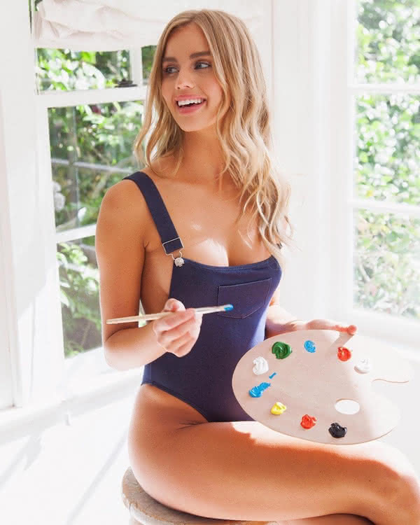
The lady is wearing a workman's overalls, turned into a swimsuit, or maybe a swimsuit made out to look like a workman's overalls. The colour, texture and pocket are those of a workman's overalls, the rest is clearly a swimsuit.
The photo is low in detail, with many nearly single-colour areas, with high contrast between the areas and some vivid details.
It is rich in action even though there's no movement. Even though most parts are nearly monochrone, the total photo uses colours and other elements to be maximally striking:
- The overalls-swimsuit constrasts with itself,
- the boobs and long blond hair attract the eye,
- the two meanings of painter busy the viewer's subconscious,
- the photoshop-enhanced edges make everything stand out,
- last but not least, her face is stands out by being rich in colour.
A advertising/logo designer I met talked about using intrinsic contrasts and asymmetries to attract and keep people's attention. He would love how the overalls she wears are the kind used by a painter to paint a house, while the palette she holds is the kind used by a painter to paint a painting. So is she a painter or a painter? Just the thing to make the subconscious direct your attention at the photo and keep it there for a few seconds extra.
Now that you've had your attention on it for so long, here's a link to buy it, directly from the designer.
Next, the app.
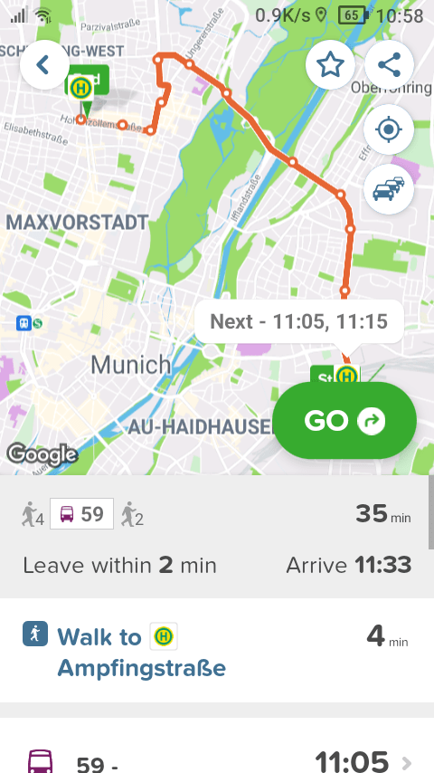
This uses subdued colour palette in most areas. Note the dampened details and a restricted palette in the map, which is subdued enough to work as a background, even while it has enough contrast to be usable on a smartphone screen in sunlight.
The app uses a single font, and the general visual language matches the font. The rounded corners look like the rounded letters.
The app avoids ornaments. There are no active screen edges, and the number of frames and borders is kept to a minimum. There are only three things: A map, a form and a button.
However, there's very strong contrast between those three. The GO button got all the emphasis: a vivid colour, upper case, bold text and it's even animated. The others are subdued, the map with few colours and the form with few details.
Just like the photo, the app uses the entire colour spectrum and every available kind of emphasis, but only once. Most things are subdued, restrained, and then one thing stands out!
The bold text: Little, but very bold. Larger text: Little, but very large (and in upper case). The colours: One colour is strong, and it's used sparingly, the rest of the colour use is restrained. The app uses animation, once.
Every kind of emphasis is used, but only once each. These pictures aren't unusually calm by historical standards, and not unusually noisy either, but both of them use contrasts deliberately.
Both of them restrain themselves in general, so that they can use even more contrast in the exceptions. That, I think, is the core of early-twenties visual fashion.
The app is called Citymapper and here's a link to the app itself. It's a great app, both functionally and in the way it uses early-twenties fashion.
As a footnote, I'm not suggesting to use this design. It looks modern, but looking modern isn't necessarily appropriate and this way isn't the only way to look modern, either. I am suggesting that apps use design, and that it's better for the apps and users if that design is thoughtful. Using the system font can be a thoughtful design choice, or just thoughtless.
Thoughtfully choosing to use the system font etc is fine. Noone gets fired for buying IBM and choosing to look conventional is a fine choice.
Here is a portrait of a Vogue editor, with a hairstyle rather like my own and looking both conventional and modern in a different way, or is it really so different? Her use of jewelry is subdued, but the ring is a big one. Her colour scheme is restrained, but with one strongly contrasting element, namely the dots. She uses elements of modern visual fashion to achieve a rather different look, a sort of timeless modernity. She looks as if she knows what she's doing. What decisions did she make to she achieve that look?
The same decisions could produce a fine user interface for an app.
