A short digression on humane architecture
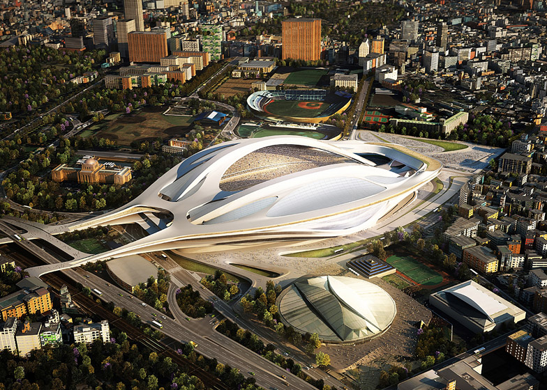
This stadium was designed by Zaha Hadid and meant to be built in Tokyo:
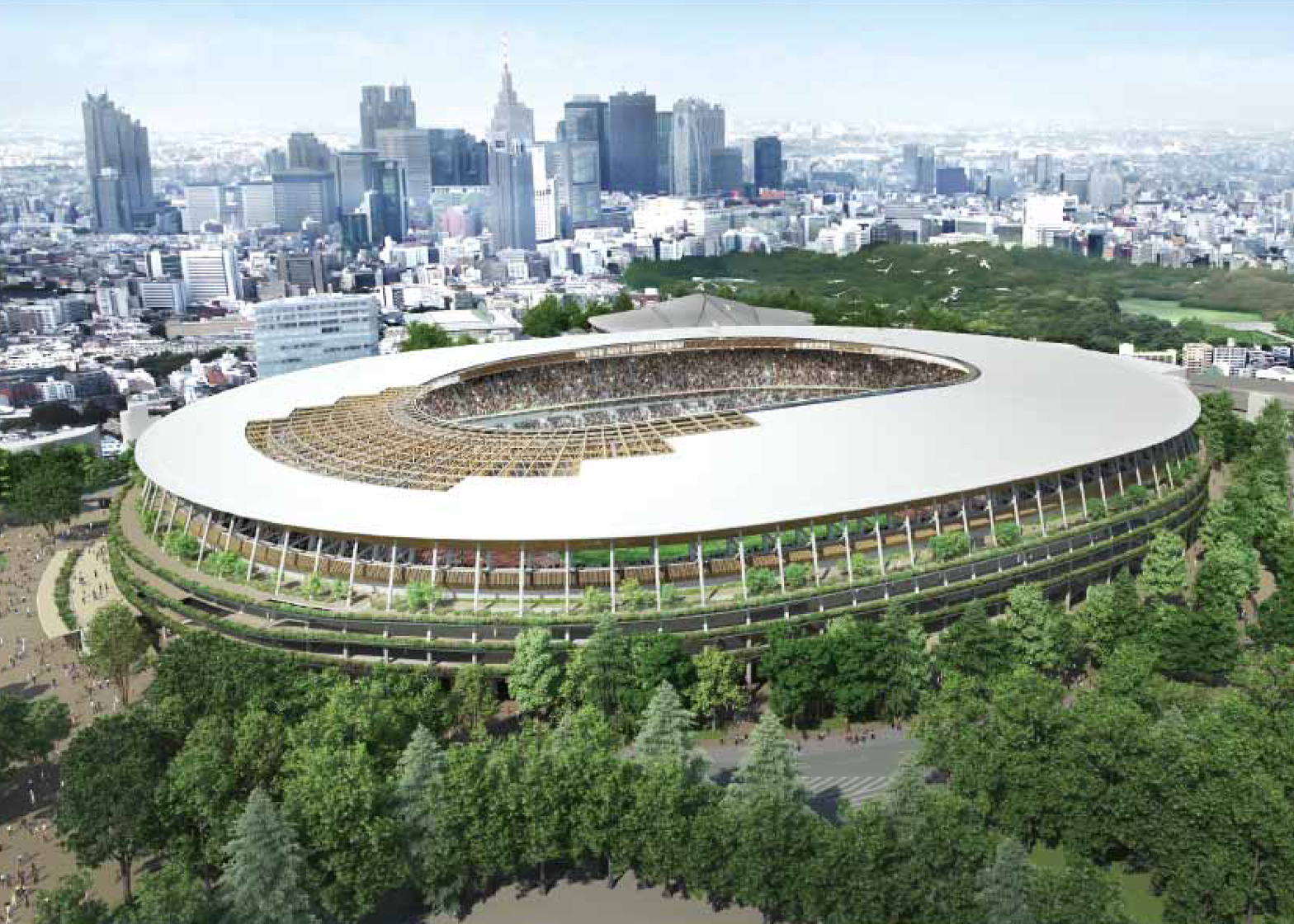
I don't actually know, but I expect that the committee felt that it might be a landmark like the Sydney Opera House, famous, forever photographed. The committee scrapped it, though, and decided to build this, instead, and it makes me so happy:
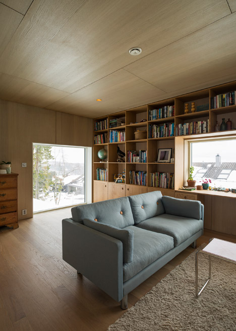
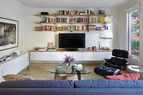
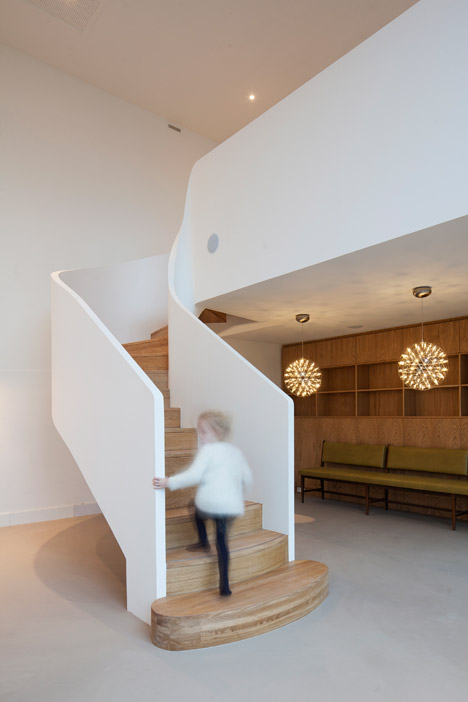
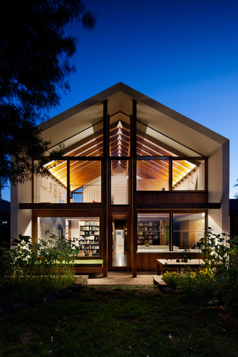
Much more humane. By comparison, Zaha Hadid's white wonder looks like a science-fiction paperback cover. It doesn't look bad, at least not to me, better than e.g. what they build in Dubai, but the humane vision is clearly Kengo Kuma's wood structure.
I'm not sure why this is.
Part of it is wood. You can shape concrete freely and at any scale, wood retains some relationship to the size of a tree, even if modern use of glued laminated wood weaken that relationship. Or perhaps someone who starts out planning with wood has already decided on a humane philosophy for the building?
Part of it is structure. Consider the Empire State Building, perhaps the most widely-known tall building except the current record holder, whose name is invariably forgotten as soon as there's a new record holder. Thirty other buildings have been the tallest after the Empire State Building, and twenty-nine have been forgotten. I think the big reason is they lack humane structure. Wikimedia has a revealing photo of the Empire State Building and some neighbours where you can see how it looks like the brownish building in front, not like the glassy cube to the left. It's tall, to be sure, but its appearance is not detached from human scale. There's some very clever design there that stretches humanity up, far up. There are small structural elements, bigger ones, even bigger, and that continuity of structure connects the street with the sky.
Perhaps: A building is humane if it can be seen to be made of human-sized components. A hundred-meter soaring curve of concrete can be a fine thing, but human-sized it's not.
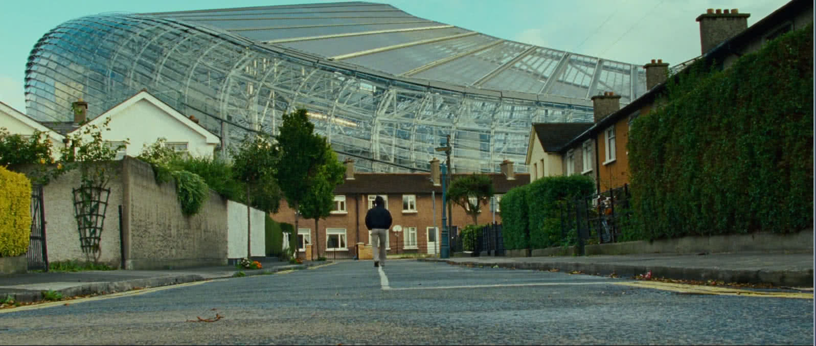
Personally, I think that Zaha Hadid stadium would look awful when seen from much of the area around it, despite its memorable beauty. It would be immeasurably bigger than and completely disconnected from the buildings in front of it. Behold a Dublin street:
