This is a greatly simplified version of a streaming site homepage. The original (it's been improved since) pulled in several hundred assets to support various features; this replica has only one feature, because I wanted to simplify the exposition.
There was a large picture at the top, today's featured something something. Like this, except that it was much wider and had a bit of text on the side, a price tag and an inviting button labelled play.

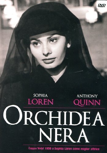
Below the featured something something was an array of smaller posters. This example has a row of four, the real thing had an array of dozens. Here comes the nice feature: When you clicked on any of them, it replaced the big poster instantly — the change was implemented in such a way that there was no waiting. Snappy UI! Go on, try it:

| 
| 
| 
|
Most people think scaling in the browser is bad. My own viewpoint is nuanced (display resolutions do vary), but I agree that scaling dozens of 1600×900 images down to 160×90 in the browser is going too far.
The real thing had extra text hat it also replaced when you clicked, and links to customer service, and metrics galore, but I removed all that. Simple examples are good examples. I also picked smaller images: I ran out of patience before finding a set of four likable high-resolution film posters. I found more pictures of Sophia Loren, but not film posters.