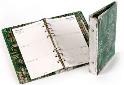
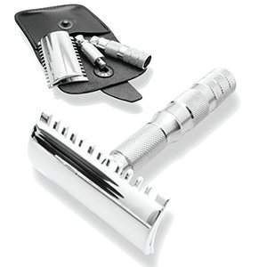
The two pictures show things I usually bring along in my hand luggage on the plane. Guess which one the security screeners want to look at most often.


Correct! The razor gets a brief glance or no attention at all (usually), the organiser looks odd on their screens and is often inspected. Mine was going to become a 9600bps modem when it grew up, as I have told many a security screener.
Ever since I got my first duplex printer I've made my own paper for it. Nothing very fancy, really. Four constraints only: ⓐ I like to write on the right-hand side, ⓑ occasionally I want to measure something so there should be a ruler, ⓒ when I tear out a page to give to someone it can be useful to give them my name and phone number, and finally ⓓ I like to have open space to draw.
The first step is to test the printer and adjust the output. Most printers print the two sides of the paper slightly displaced or rotated, but it's easy to correct for that. Here's a postscript program to test and correct. Print it, hold the printed sheet against the light, tweak the source, repeat.
Second, you'll need a hole puncher and a paper cutter. The puncher was a little difficult, apparently the geometry of 6-hole diaries varies a little.
Once the preliminaries are over, it's time to write postscript. Postscript is a fun little language. Here's the file I currently use. It has changed over time, as my whims change. There's no calendar any more: the phone has taken over that task. The file should be amenable to further change. I suggest printing close to as few edges as possible so you don't have to be so careful when you cut the paper afterwards. My design demands annoyingly precise cutting. Next time I cut, I'm going to modify it so that only three of the six cuts per page have to be precise.
I'm glad that my four-fours advent calendar enjoys a small following. I have even heard that certain programmers have been seen arriving at work before lunchtime, going straight to the calendar on the way in.
The original idea for the calendar came from the column Numbers Count in PCW magazine sometime in the eighties. A stylish column in a fine magazine: It published mathematical problems and occasional puzzles, and did not waste much space on answers. One of the puzzles was to count from 1 to 20 using four sevens. As I recall, I found 19 to be the most difficult.
I first tried to extend that to 24 to make an advent calendar, but had to give up on 23, which blocked me for a few years. Four fours was much easier. This year I tried four threes. Again, 23 looks poor, so but one can always choose to pay less attention to that and more to 24, for which I found several good possibilities. Which is the most elegant 24, 3!×(3⁄3+3) or 33-√3×3? Or 3√3×3-3 perhaps?
Again, there's both an advent3.ps postscript file and an advent3.pdf PDF version.
By popular request: my postscript hack to produce a four-fours advent calendar.
Each of 24 printed pages bears a label such as 4+4/4-4
or 4+4×4+4
. Print, fold e.g. as shown below, insert pralines, […More…]
When my previous printer ran low on toner, I bought a new printer. Billing is critical. A Brother MFC-8880DN, which I already know from setting it up for someone else.
It's a decent network printer. Notable positive aspects: It can scan in colour (even though it's nominally a monochrome printer). […More…]
I've had the 4828 for half a year, and have had several bad experiences.
I have crashed the printer twice. Once by printing the guice guide using chromium and once by printing a book-length ΤΕΧ (dvips) document, mostly text with some tables and figures.
The copier is really, really bad at copying grey-on-white or green-on-white text. […More…]
I have a Samsung SCX-4828FN printer/fax/copier/scanner, and use it with linux and BSD. (Update: I've a follow-up posting about the printer.)
The printer is fine for black and white text, such as I usually print: Fast, crisp text with fine edges, nicely readable. Duplex printing just works. The printer can print quite close to the paper's edge, too. […More…]
The four major output formats (long print, piecemeal print, ASCII on screen and hypertext) all have their fans, all have their uses, the ideal system would support all four, but it isn't possible to support all four really well.
Writing, designing or encoding for plain ASCII just isn't the same as writing for pages. One of the books I read ages ago had a very nice example, showing two pages of text vs. one screen of text. The pages allowed boxes that didn't intrude on reading the regular text, fine graphics, and easy overview of a lot of data. In all, around six times as much information in front of the reader's eyes. […More…]

